RAY International is known as Rukun Al Yaqeen International
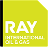
The name and visual identity of the company RAY is a solid square with a distinct dye cut at the right hand side top corner that represents the RAY Group logo. The uniform gradient of green renders finesse and aesthetic appeal to the logo.
The solid square with the dye cut portrays :
- The pillar of faith and trust at the Ka’bah, in the Holy Mecca
- The distinct cut at the right hand side top corner represents the angle of faith in the direction of Ka’bah while performing prayers.
Whilst the logo upholds Islamic theological significance, it symbolizes camaraderie and unity of the RAY Group.
- The logo in the shape of a solid square block signifies the Strength and Solidarity of the Group.
- The dye cut at the top, that gives the impression of unfinished square, represents the yearning of growth, to be a compete whole.
- And the green is paramount to the Group’s vision in the business world. It also signifies the Commitment to Our Environment.
RAY International Energy
RAY Insurance Services
RAY International Oil & Gas